 Drift: Building the Foundation of a Unicorn Brand
 Metadata: Building The Next Unicorn Brand
 Goodtime: Completely Brand Overhaul in 3 months
 Privy.com: Brand Makeover
 Client Reactions
A lot of B2B teams get caught up in how their brand looks on LinkedIn. Fair enough. It’s public. It’s where your exec team hangs out. But here’s the problem:
Likes ≠ pipeline.
If your design only looks good in the feed, but falls apart when someone hits your site, reads your deck, or sees your ad… you’re leaking revenue. Slowly. Silently. And it’s costing more than you think.
We see this all the time:
- You read a sharp LinkedIn post… then land on a page that looks thrown together at 2 a.m.
- Solid messaging in a sales deck… ruined by mismatched fonts and messy layout
- An ad that stops the scroll… sends people to a dead-end experience
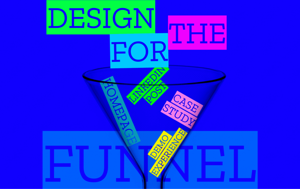
So what should you be designing for?
Design the whole journey. The funnel. The follow-through.
That means thinking like this:
- Top of funnel? Make sure your brand grabs attention but also feels real. No stock icons. No fluff.
- Mid-funnel? Make your decks and one-pagers easy to scan, smartly structured, and visually pro.
- Bottom of funnel? This is where trust is won or lost. If your pricing page, proposal doc, or onboarding flow feels sketchy, it doesn’t matter how good your branding is.
TL;DR:
Design isn’t just about showing off on social. It’s about removing friction. Building trust. Creating a consistent experience from first click to closed deal.
If you’re only designing for the feed, you’re not building a brand. You’re just borrowing attention.